
Pantone, the doyenne of commercial colour matching has chosen ‘white’ for its colour of the year. Hey, don’t stop reading… let’s take a 5-minute look at the relevance of this left field choice for the UK’s property market.
Pantone’s Colour of The Year, Cloud Dancer, is a tranquil off-white – it’s a “symbol of calming influence in a society rediscovering the value of quiet reflection.”
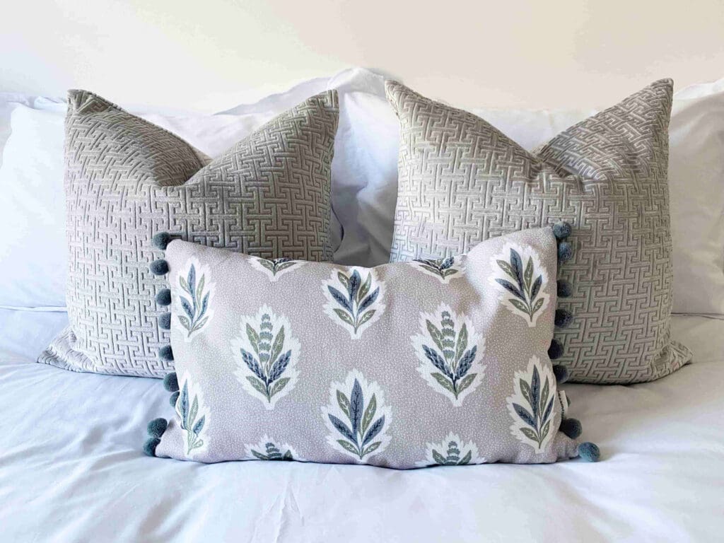
Industry critique of Cloud Dancer uses adjectives such as ‘spaciousness’, ‘stillness’ and ‘spa-like’. It is the significance of these words, and not a 10L tub of Cloud Dancer itself, that should be incorporated into your next project.
Why? Pantone’s exhaustive, annual research for the global zeitgeist concludes that what we desire in 2026 is serenity. “Cloud Dancer encourages true relaxation and focus, allowing the mind to wander and creativity to breathe, making room for innovation.”
In essence, 2026 is the year of making your property feel even more like a haven to your prospective client; a space that offers sanctuary from the moment they step inside. How might it be possible to meet those fundamental desires for security and calm in your property?
Could the extensive market research behind Cloud Dancer be a game changer for you and your property’s appeal?
This is where colour psychology comes into play as part of your marketing strategy. Colour psychology the practice of using colour to influence our emotional response to space – you see it used in fast food restaurants and upmarket boutiques, but it is also a key tool in successful interior design for property pros.
How you decorate and present your property speaks volumes to your ideal customer, even if they can’t articulate their response on a conscious level. Colour is the unspoken ‘body language’ each space adopts when surface finishes are applied. Colour works on subliminal but powerful level, raising our heart rate and energy levels, or calming our busy minds. You can attract your target audience – and command better yields – with a consciously crafted colour palette.
So, what does Cloud Dancer mean for builders, developers, investors or landlords in 2026?
Thankfully, white versatile colour choice – but of course there are hundreds of shades of white paint out there. This is not a green light to buy builders’ white! You do not want your property of feel clinical. So, please read on…
If you grab a selection of white paint swatches you will realise how different they all are, side by side. White paint has a language to describe its subtle differences: ‘warm whites’ have yellow, pink or red undertones; ‘cool whites’ have blue, grey or green undertones; and ‘neutral whites’ have a minimal colour bias, are well-balanced and almost chalky.
It is important to consider that white walls can reflect the colours around them, so that even a neutral white wall above a grey tiled floor, for instance, will take on a slightly cooler appearance.
Here’s a quick guide to choosing the right white to work in harmony with the aspect of your rooms.
In north-facing rooms natural light is cool (think grey or blue) and indirect. Creamy or yellow-based whites will give the room the lift it needs, so avoid white finishes with a grey or blue undertone. Top tip: install warmer lightbulbs in your light fittings (2700-3000K) to warm up the room when natural light levels are low.
South-facing rooms receive maximum natural daylight, meaning a bright white can feel glaring. A flat matt paint, like Little Greene Paint’s Absolute Matt, will help absorb harsh light on the walls. A cool white with blue, green or grey undertones are good choices to balance the natural warm light.
In East-facing rooms the morning sun brings brightness early on, but by afternoon this room can feel dim. A warm white, with a rich pigment, will complement the changing light conditions through the day; avoid bluey whites or any white with grey undertones.
West-facing rooms have naturally dimmer light in the morning but catch the rich, often golden light later in the day. White painted walls can appear to change dramatically in these rooms and a warm white with just a hint of grey will work well here.
Before choosing your own, white-based colour scheme, consider the age and architecture of your home. Cloud Dancer is contemporary white, working well as a neutral canvas on which to add splashes of judicious colour, chosen to appeal to your target audience. For older properties, why not browse heritage paint ranges to compliment the property’s history, like Edward Bulmer’s Fair White, which is rich in natural pigments and low-VOC.
Take a moment to consider the atmosphere you want to create in your property. Are you trying to appeal to students, young professionals, first-time buyers or retirees? What are they looking for practically and emotionally at this point in their lives? The benefits of a white palette are its broad appeal, ease of customisation, and ability to outlast fleeting trends.
The power of meeting your ideal customer’s wish list on an emotional as well as practical level is not to be underestimated. If finding the perfect palette is not your area of expertise, a professional interior designer can help.
At Annabel & Co we combine colour psychology and our interior design training to create Insta-worthy spaces that will wow your ideal client. We love to work alongside property professionals to co-create easy-to-implement schemes that offer a great ROI – or a great Return on Interiors™.
To find out more, email hello@annabelandco.uk or fill in our contact form online.
Annabel & Co help clients market their property with greater confidence through interior design and property staging. We support property professionals across Lincolnshire, Rutland, Nottinghamshire, Leicestershire, north Cambridgeshire, South Yorkshire and the Humber. We also collaborate virtually with clients nationally and internationally. Our business is built on service and style and sustainability, with lower carbon options offered as standard, helping our environment and your ESG.
